Finding the right typeface for your backgrounds requires thoughtful consideration of the mood, colors, themes, and readability. Let me guide you through these 3 essential tips to enhance your typographic and media choices, ensuring that your services are as captivating as possible.
1. When in doubt, use bold text to stand out.
In the process of picking the perfect typeface to complement your background, several key questions should guide your decision:
- Is the background busy or minimal?
- Is there motion, and if so, is it fast or slow?
- Are the colors vivid or muted?
If you use a typeface that is hard to read, it can lead to discomfort.
Consider this tip: avoid thin typefaces and scripts. Instead, opt for a bold, sans serif font and add a subtle shadow for simplicity and readability. And to further ensure that your text stands out without sacrificing style, consider adding a rectangular container behind your text.
View the examples below to know what to avoid, and what to do instead.
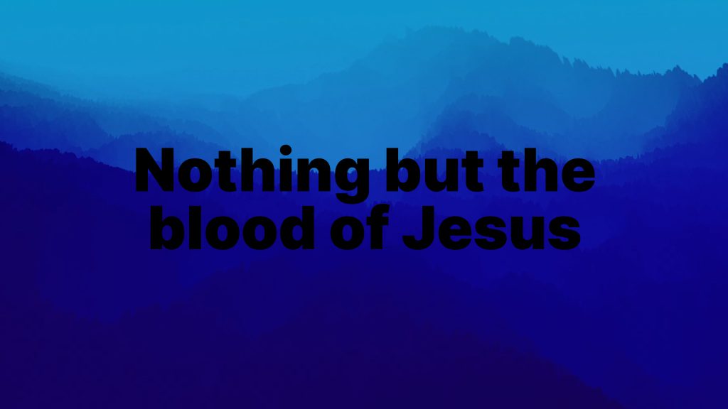
❌ Avoid thin typefaces to prevent discomfort.

✅ Choose bold text and add a subtle shadow to enhance readability.

✅ Place a container behind the text for optimal readability. Extra design tip: sample the colors in the background for the container color to keep it looking stylish.

2. The color of the typeface will make or break your design.
Choosing the wrong color for your typeface against certain backgrounds can dramatically impact the readability of your text. A typeface color that blends too closely with the background or clashes harshly can strain the eyes. This is why opting for a white or black typeface is often a safe choice. These colors offer the highest contrast and readability on most backgrounds. But remember, use black text on brighter backgrounds, and white text on darker backgrounds. View examples below.
For dark backgrounds:
❌ Black text
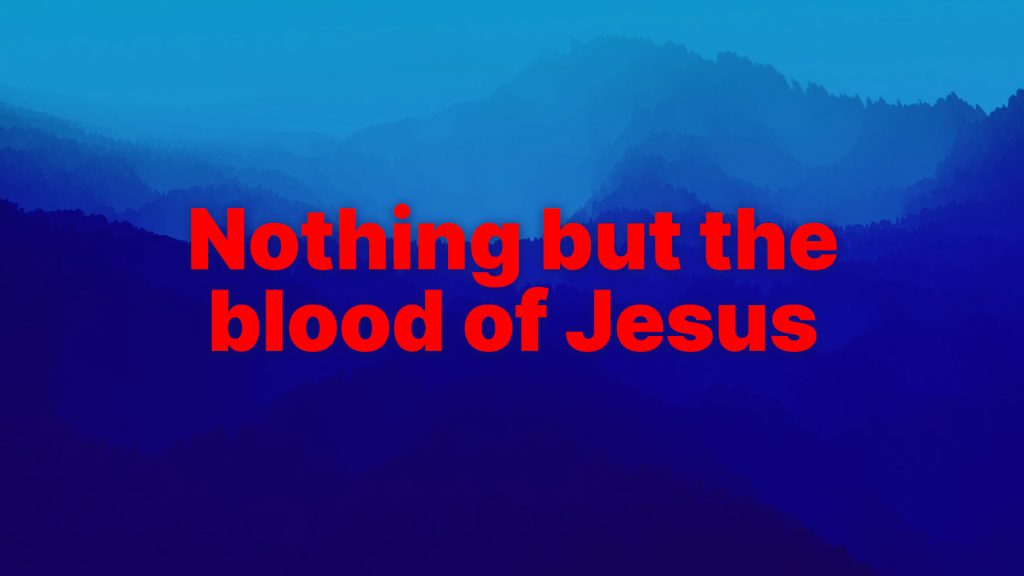
❌ Text that clashes
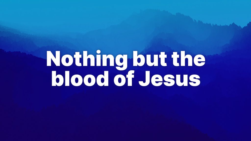
✅ White text
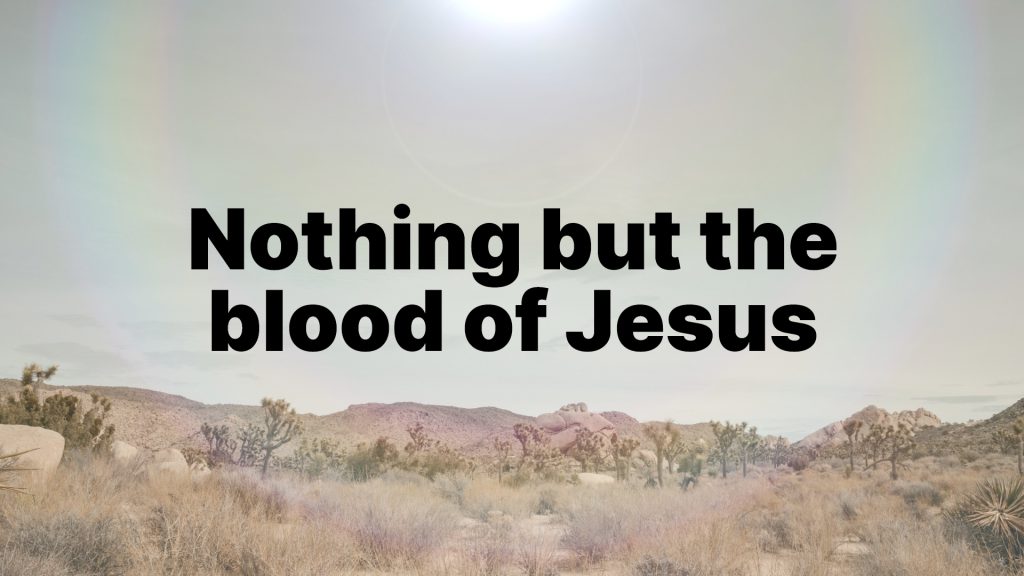
For light backgrounds:
❌ White text
❌ Text that clashes or has low contrast
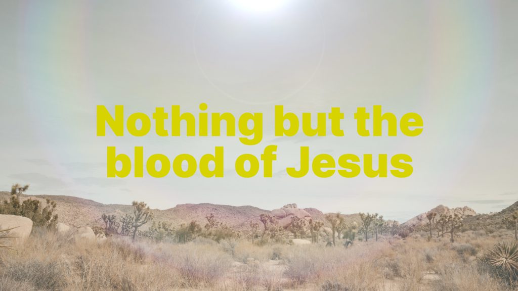
✅ Black text
3. Keep your content fresh and relevant.
And finally, keeping your church media fresh and relevant is crucial for engaging and connecting with your congregation effectively. For instance, using summer themed media during Christmas services can create a disconnect, just as outdated media may fail to engage younger generations. Ultimately, keeping church media fresh and relevant is a powerful tool for enhancing worship and keep it meaningful for everyone.
❌ Irrelevant media can cause disconnect.

❌ Avoid outdated media.

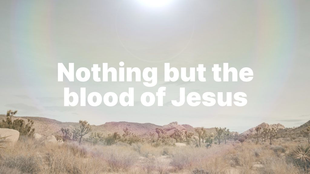
✅ Use relevant media for the season or theme.

As you navigate the world of typography, remember that it’s not just about making words look pretty; it’s about enhancing readability, conveying meaning, and evoking emotion. With these typography tips in your arsenal, we hope you feel well-equipped to now create visually stunning and impactful church slides!