Hey guys, Raisa here with some good news. You too can be a graphic designer! Well, maybe. Let’s see how close we can get you there. 😊
Things are a bit crazy right now, huh? Just a tad bit. Connecting via social media seems to be the way right now, more than ever before. And for a church, connecting is important. So what’s one to do with no design skills but wants to be noticed between all the toilet paper memes and cute cat videos? Here are some things that help me get a social graphic piece together.
First, find Inspiration.
I honestly think this is the most important step. Moreso than technique, I prioritize vision. I search Pinterest, Google, Behance, or just scroll through different graphic sites like istockphoto or creativemarket for themes or any sort of inspiration. Sometimes it takes a shot of espresso or just stepping outside for a moment of fresh air. You’d be surprised what could spark inspiration of color or emotion. And it may be different avenues for different designs. But don’t skip this step, it is crucial for the process and can even save you time in the long run. I start by creating a folder, titling it the project name such as “StayConnected_SG” and just drop all of the things I like pertaining to the graphic in there.
2. Create A New Document
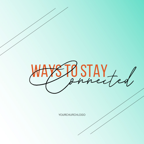
Before starting to design, think of the copy you want to use. So if we are running with a “Staying Connected” post, your copy might be something like “Ways To Stay Connected” or “Who Did You Connect With Today?”. Now I open a blank canvas, type in the copy and start to play. I don’t worry too much about the font selection yet – we need to establish the design feel first. Just use a simple Helvetica font in black to get you started and the juices flowing.
3. Start compiling your ideas & inspirations
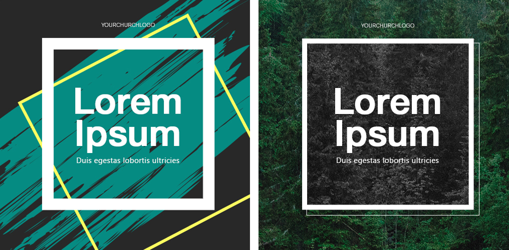
Whether it’s creating a simple frame around the text or adding a couple splashes or strokes, start compiling your assets and ideas from your folder. Sometimes the more simple the design is the easier it is to understand, especially when people spend an average of half a second per post while scrolling! The message needs to be short, and easy to see, quickly.
Once you have a basic design in place you like, it’s time to find a font that fits the theme. My 2 top free sites are dafont.com and Google fonts. There is a place to type in your copy on both sites and as you scroll through different font styles, it will show you how your actual copy will look. If you are able to have 2 monitors side by side, leave your design template up on one and scroll through fonts on the other- side by side, to make sure you catch the overall design feel you are going for. The worst thing is to spend a ton of time finding fonts you like, then once they’re downloaded on the computer and in the template, it doesn’t match the theme whatsoever. Once you find a font that matches the design, you can adjust graphic pieces, remove or add graphics, and align, align, align!
The Last Step
This last step is golden, I should actually charge you a fee for the following tip, but I won’t this time.
Walk away.
Yep, that’s right. Walk far, far away. Grab a fresh cup of coffee, scroll your social media feed, return your mom’s phone call (I still need to do that), step outside for some fresh air, or even take a nap. Come back, open the file and look at it with fresh eyes. You will either love it or hate it. Best case scenario there will be a few things you will want to adjust and call it done. The key here is to see it with a new perspective, almost imagining yourself in your audience’s shoes. Ask yourself “Is this the message you were actually shooting for?” or did you get lost in a rabbit trail for something else? Because at the end of the day, creating an impactful post is about purpose, not only beauty. The ultimate goal is to have a clear, definitive message with a complementary look.
Tips & Tricks:
The beauty is in the eye of the beholder, right? Sometimes. In the digital world, there are trends and standards, and it changes often. A couple tips I follow:
Color
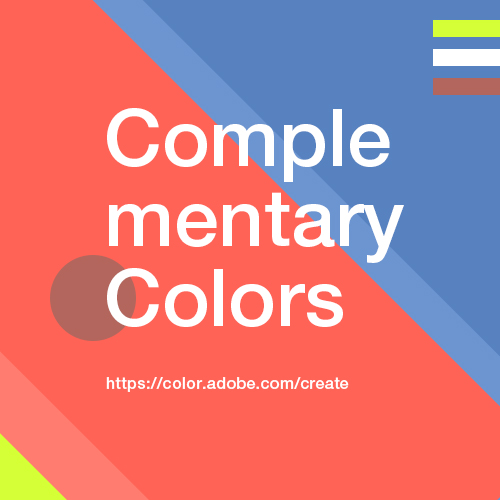
I love following Pantone for the color of the year, I feel like I’m “in the know” when I use it, but be careful not to overuse it. Be conscious of color combos and background contrast. I recently was watching a live streaming service online, they had a grey stage and even though the lighting was sufficient on the minister it was overall dark but easy on the eyes. However, when they switched to the scripture slide, the background was stark white with dark lettering. The switch back and forth to minister and scripture was quite a contrast difference and not easy on the eyes, a distraction more than anything. Which brings me to a fun fact: Most people have opinions about visuals, and have emotion attached to it – not because they are designers or have a distinct opinion about design but because something feels “wrong” or “off”. These types of minute mistakes make people feel like something is not right but they can’t pin-point it. Which is not a good thing. So color is huge in my book. My favorite color helper is Adobe Color Wheel. It’s awesome, and will help guide you to all of the color combinations you will ever need, and make you look like a PRO!
Font
For someone whose full-time job is not design, this one could be a toughie. I’ve heard many designer jokes about how picking the font is the longest part of the project. As funny as this may sound, every single graphic designer I know has spent WAY too long picking a font at one time or another. Don’t make this mistake. If you don’t know whether to go with cursive or block, find a happy medium. Can’t go wrong with a simple Helvetica. I use 1 font style with 8 weights and I can get away with making 10 or more posts with this one font family with a possible added cursive font for variety, without looking too repetitive. It actually will define more of your church branding if you stick with the same or similar font styles. Try to match the font style of the inspiration graphics you started with. Don’t steer too far from them, and you will be fine.
Layout
Balance is everything. When placing text and graphics on a template make sure it’s not tipping over the boat with something heavy on one end and something proportionally off in another area. For instance, if you want to just go with a simple, bold statement, keep it centered instead of at the very top or bottom without anything else to fill in the opposite space. Adding something like a brush-stroke or paint splatter will draw attention, but not overwhelm the space with a ton of imagery. Another idea is to use a high-res photo as the background, and overlay text on top, adding a layer of either light or dark to make your image fade but your text pop. With that said, don’t be afraid to draw outside the lines. Play with shapes, sizes, and positioning. Remember to have fun!
I want to leave you with some resources that do most of the work for you if you prefer that instead of making a graphic from scratch. As much as YouTube tutorials or Adobe tutorials are super-duper helpful, these resources listed below will pretty much do the work for you. If we missed any helpful resources, comment below!
Lightstock.com – A resource of stock photos that is specific for Christians.
Canva.com – Online software that lets you design with templates and layouts for free. There is a premium version as well.
Adobe Spark (App) – App that lets you design social graphics with templates and layouts.