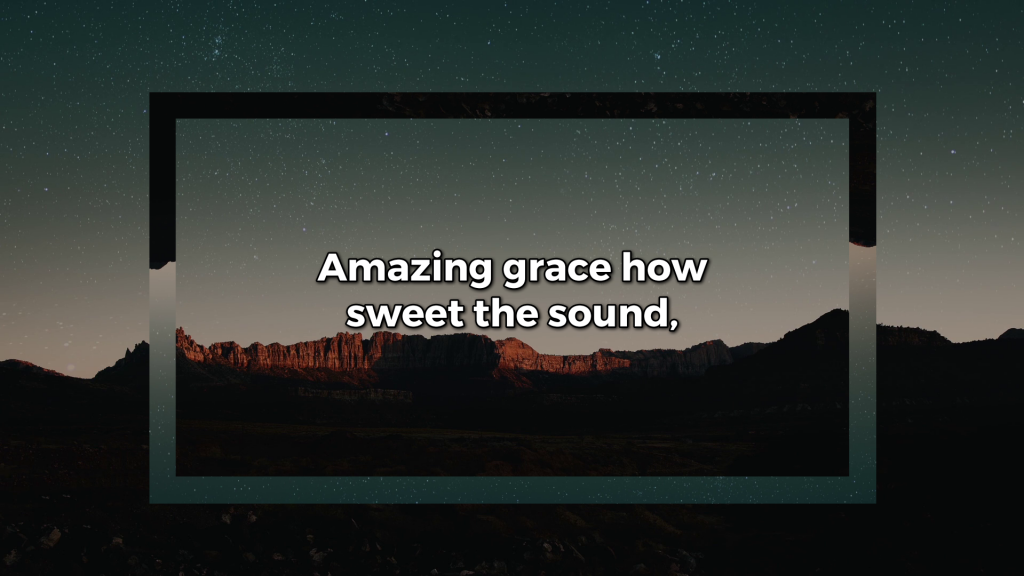
A blank palette can be an inspiring or daunting place to start. No matter which way you feel, the newly added Shape Engine can make your job designing slides easier.
We’ve added a variety of shapes, from basic, to banners and callouts, as elements that you can add to any slide when you build it in the Editor. Each shape can be adjusted, filled, and modified to create a slide that is truly unique to your church experience.
Let’s run through a couple of easy ways that you can start using the Shape Engine today.
1) Keep the focus on the text
Adding a shape can actually help people focus on the text and not on the background. And it’s really easy to do.
To create this look, we added the Desert Dusk Longplay to a new Song Theme and then opened the Shape menu and selected the Square Frame shape.
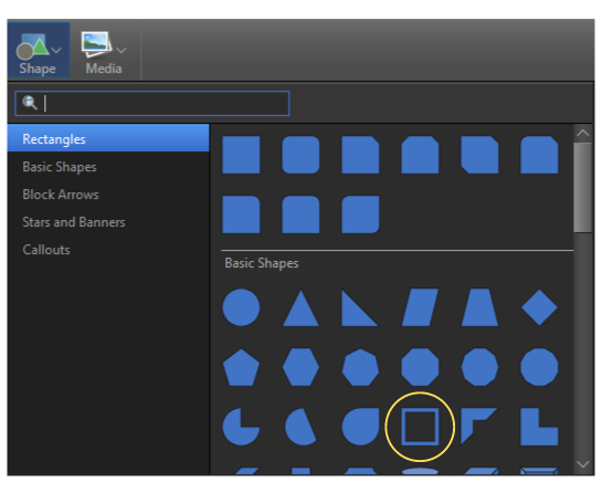
Once it was on our palette, we adjusted it to look more like a rectangle to surround the text. You can also click and drag the yellow adjustment point to adjust the width of the shape and make it as slim or thick as you want.
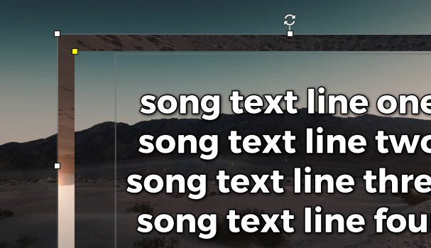
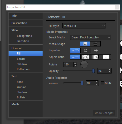
Once we had the shape where we wanted it, we filled it with the same media motion as the background through the Inspector. In there, we could fill it with the media selection of our own, and then to provide some contrast, we rotated it 180 degrees.
And that’s it! Now you have a great-looking Song Theme that you can use for any occasion.
2) Masking Your Screen
With the Shape Engine, you can also add a shape to your slide and mask certain parts of your screen so that you can make it fit any place in your building.
Simply add a Shape, resize and change the shape to fit what you need to mask, and instead of a Media Fill, you can choose to fill it with a Color Fill of your choice.
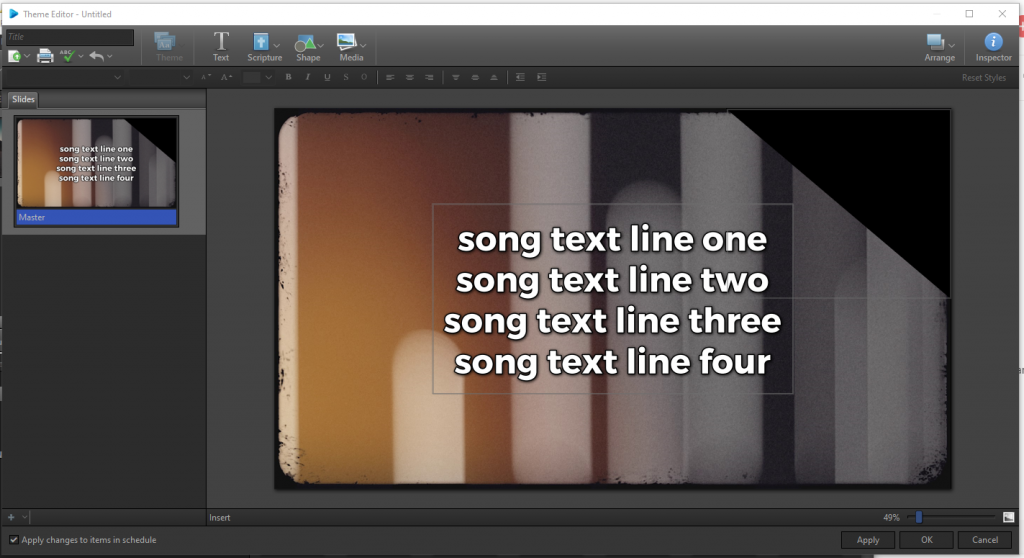
Or you can use the Shape to highlight what you want to be seen and use the background as your way to mask out what you don’t want to be seen as shown below.
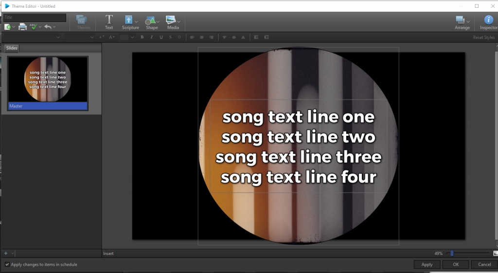
Either way, with the Shape Engine, you now have the ability to make your slides work even easier for you and your service.
